Global Development Atlas: Interactive Data Visualization
The Global Development Atlas project was conceived as an opportunity to deepen my expertise with APIs for a college JavaScript course. The primary goal was to build a dynamic, client-side application that could fetch, process, and visualize complex global development data from the World Bank, making it accessible and understandable to a broad audience.
Visit
the Site
My Role: Front-End Design & Development
As the sole developer, I was responsible for the entire project lifecycle, from initial concept and design to the final implementation. All development was focused on the front-end, with no server-side components. My key responsibilities included:
- UI/UX Design: I designed the complete user interface and experience, focusing on making intricate data easy to parse and visually engaging.
- Front-End Development: I wrote all the HTML, CSS, and JavaScript code to build the website's structure, style, and core functionality.
- API Integration & Data Management: I implemented the logic to communicate with two distinct APIs, handle data requests, and process the received information entirely on the client side.
Overcoming Development Challenges
This project introduced two significant technical hurdles that were crucial to my learning and growth:
- Handling Paginated APIs: The World Bank API presented a new challenge for me. Due to the sheer volume of information, it doesn't transmit an entire dataset in a single pull. Instead, it sends data in paginated batches. Overcoming this required me to research how bulk APIs operate and develop a JavaScript solution to sequentially request and stitch together each page of data until the complete dataset for a given indicator was retrieved.
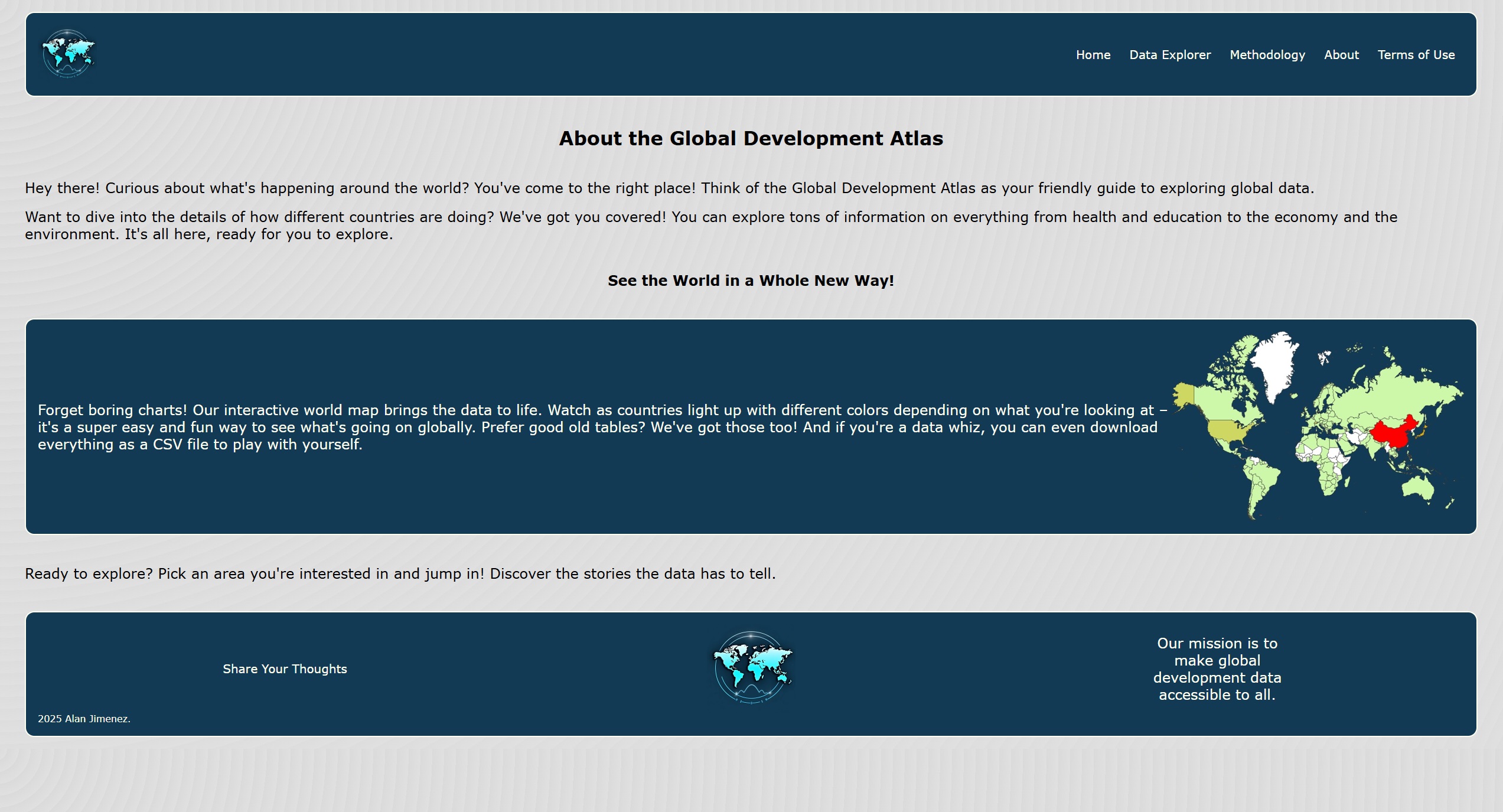
- Complex Map Interactivity: A core feature of the Atlas is its interactive world map. Implementing smooth zooming and panning functionality controlled by the user required significant coding and rigorous testing. I researched various approaches and ultimately applied a mix of JavaScript and CSS techniques to create a seamless and intuitive map navigation experience.
Technical Deep Dive
- JavaScript: This was the engine of the project. JS was used to manage all API calls to the REST Countries and World Bank APIs, process the returned data, and power all of the website's interactivity, including the dynamic map.
- HTML & CSS: These were used to build the website's structure, layout, and overall visual aesthetic. All styling was custom-coded to achieve a clean and professional look.
- API Integrations:
- REST Countries API: This was a straightforward RESTful API used to pull foundational information for each country, such as its official name, capital city, and geographical area. It delivered all requested data in a single, convenient package.
- World Bank API: This was a more complex integration. I engineered the JavaScript to handle its paginated response system, which involved creating a loop to make multiple calls and track the pages of data being pulled for any specific user request.
- Tools: The completed website was deployed to an AWS EC2 server using FileZilla. No version control or project management tools were used for this academic project.
Project Outcomes & Achievements
The project was a definitive success in achieving its primary educational goal. It served as a practical application for expanding my client-side development skills, particularly with APIs.
- I successfully implemented two different types of API calls: standard single-package requests and more complex paginated batch requests.
- The final website can pull and display dozens of development indicators across multiple categories and years from the World Bank.
- The project was very well-received by my professor, who was highly satisfied with the sophisticated functionality and polished final product.
Design Philosophy
I was responsible for the full UI/UX design. The guiding goal was to transform raw, complex data into something that was not only easy to use but also insightful for users with or without a background in data analysis. I prioritized core design principles like balance, contrast, and proportion to create a visually clear layout. The user experience focused on usability, findability, and consistency, ensuring any user could easily select an indicator and explore the corresponding data in either a visual map format or a data table.
Future Enhancements
Looking forward, I see a clear path for improving the Atlas. While the site currently allows users to download the raw dataset as a CSV file, a valuable addition would be to implement a feature for downloading the generated map visualization itself, providing users with a shareable graphic of their selected data.